1
2
3
4
5
6
7
8
9
10
11
12
13
14
15
16
17
18
19
20
21
22
23
24
25
26
27
28
29
30
31
32
33
34
35
36
37
|
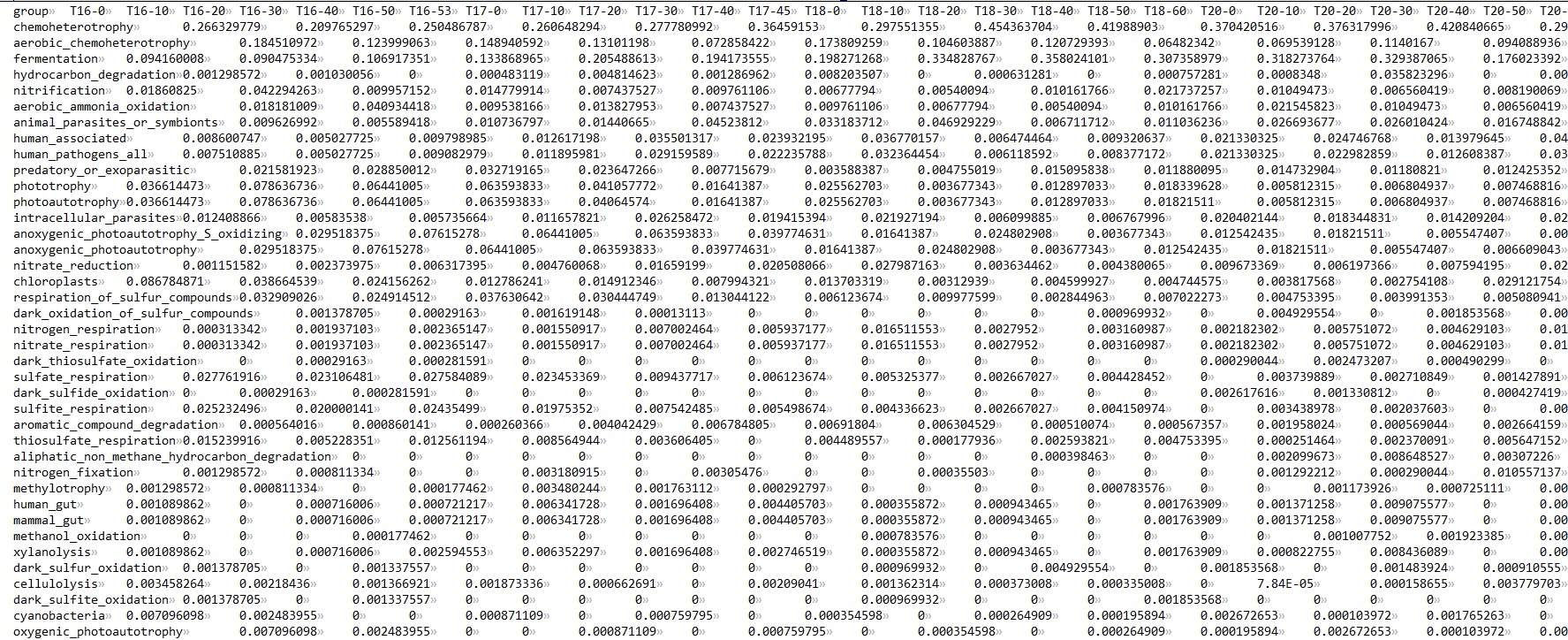
setwd("E:/Researches/lujia16S/Analysis_20200907/Downstream_analysis/Function")
data <- read.table("functional_table3.tsv",header = TRUE, sep = "\t")
library(ggplot2)
library(reshape)
data_melt <- melt(data)
names(data_melt) = c("Functions", "Samples", "Abundances")
data_melt$Sites=substring(data_melt$Samples,1,3)
data_melt <-as.data.frame(data_melt)
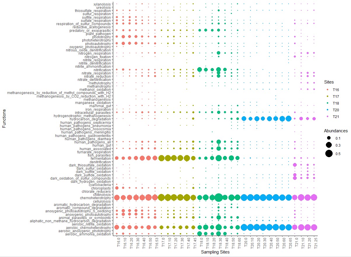
bubble <- ggplot(data_melt[which(data_melt$Abundances>0),], aes(x = Samples, y = Functions, size = Abundances, color = Sites)) + geom_point()
bubble_style <- bubble + theme_classic()+
labs(
x = "Sampling Sites",
y = "Functions",
color="Sites",
size="Abundances")+
scale_size(range = c(0.1, 10), breaks = seq(0.1, 0.6, 0.2)) +
theme(plot.title=element_text(family="Times New Roman",size=8,
color="red",face="italic",
hjust=0.5,lineheight=0.5),
plot.subtitle = element_text(hjust = 0.5)) +
theme(axis.text.x = element_text(angle = 90, hjust = 1))
|